Here is a script I've used enough times that I thought other people might find it useful as well:
https://gist.github.com/4151008
If you have 1, 2, or 3 lists (one item per line), it will print out the counts for each of the sections of a Venn diagram. Lists do not need to be sorted. Let me know if you see any problems or have any improvements for it.
Monday, November 26, 2012
Wednesday, October 31, 2012
Gene Names Are Broken
With the completion of the human genome project and the advent of next generation sequencing technologies, the wealth of information about our genes is growing at a rapid pace. Figuring out the roles of these genes is a complex undertaking in and of itself. However, we make things much harder for ourselves by giving genes multiple symbols or symbols that have another meaning. Try finding all abstracts in PUBMED that discuss the gene KIT. Not so easy (especially since the searches are case insensitive and kit may refer to many other things). Some of the gene names are as amusing as they are ridiculous (see this blog for some interesting ones, such as pokemon or sonic hedgehog - the approved gene name).
Now, I'm not the first to notice this, and there is actually a committee called the HUGO Gene Nomenclature Committee (HGNC) to "assign unique gene symbols and names to over 33,500 human loci". Too bad some of these symbols are utterly useless. The symbols may be unique with respect to other gene symbols, but they are far from unique and distinguishing.
Here are a few of my (least) favorites, there are numerous other examples:
KITEdit (Nov 5, 2012): Here are a few more wonderful examples
CAT
MAX
ACE
BAD
BID
LARGE
IMPACT
SET
REST
MET
PIGS
SHE
CAMP
PC
NODAL
COIL
CAST
COPE
POLE
CLOCK
ATM
RAN
CAPS
And the worse one ever, drumroll . . . .
T : Yes, there is a gene with the approved symbol of T (I pity the fool). Good luck finding any information about that gene.
Here is a breakdown of the lengths of the gene symbols:
# of Names Length of Name
1 1
31 2
615 3
3560 4
6296 5
4699 6
2468 7
1143 8
216 9
18 10
1 11
0 12
1 13
Why does this matter? There is too much information out there for a single person or army of people to sit down and wade through. There is more of a need for automated methods to assist in culling and processing the information. But when it is a challenging problem just to find the terms we are interested in, we are starting down a difficult road before we even get into the car.
Often times an abstract or paper will use the gene symbol rather than the full, laborious gene name, and these "official gene symbols" are too nondescript to be useful in an automated search. As the rate of information about genes out-paces our abilities to manually curate it, useful information might be lost or false conclusions may be drawn due to the ambiguity of our naming conventions.
Monday, October 15, 2012
Fun with Bacteria
Recently, I've taken an interest in metagenomics, which involves identifying micro-organisms directly from environmental samples (such as the ocean, soil, human gut, and even the belly button). The identification of the organisms can be accomplished by reading the DNA within the environmental sample and determining which type of organism the DNA came from. The advantage of this approach is that you can study micro-organisms that cannot be easily cultured in the laboratory, but the disadvantage is that all the DNA is mixed together, and it is a challenge to identify which species are represented.
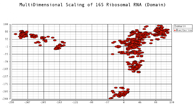
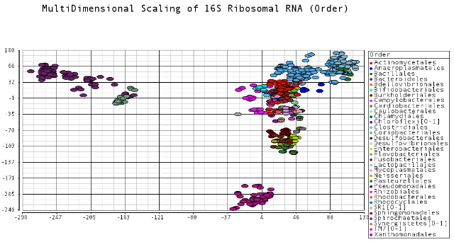
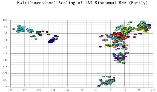
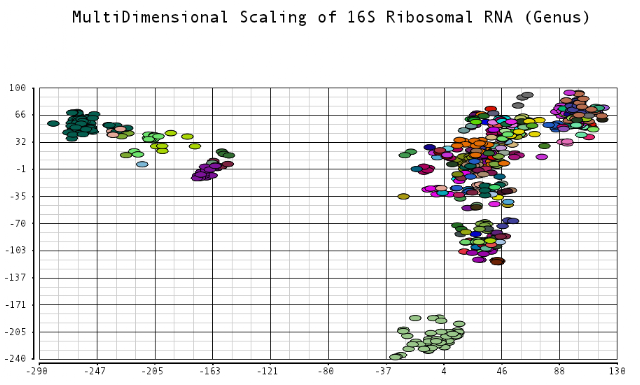
One approach for identifying different varieties of bacteria is to look at a specific 1,500 length sequence referred to as 16S ribosomal RNA. This sequence is ubiquitous in bacteria but various enough that different species of bacteria have slightly different sequences. These sequences can be captured from a sample and read, and used as barcodes to identify what types and the abundances of bacteria are present.
I thought it would be an interesting exercise to plot the dissimilarities of these sequences. Sequences that are closer to each other would indicate species that have diverged from each other more recently. I was curious to see the relationships among these different bacteria species. Data was obtained from the Human Oral Microbiome Database. I used multidimensional scaling to plot the data in a low dimensional space that could be visualized. The metric I used to calculate distances between sequences was the Levenshtein (edit) distance, which is the minimum number of edits (substitutions, deletions and insertions) to transfer one sequence into the other.
I color-coded the data points by the taxonomic ranks (Domain, Phylum, Class, Order, Family, Genus). As one would expect, species that are in similar ranks tend to be closer together on the plots. There seems to be three main clusters: (1) the Bacteroidetes, (2) the Spirochaetes, and (3) everything else. The everything else group seems to contain clusters too, just not as separated as the main 3. From the 3D plot, you can see that the Proteobacteria (Betaproteobacteria and Gammaproteobacteria) separate relatively well from cluster 3.
Here is the MDS plot colored by Class (2D):


x <- fit$points[,1]
y <- fit$points[,2]
One approach for identifying different varieties of bacteria is to look at a specific 1,500 length sequence referred to as 16S ribosomal RNA. This sequence is ubiquitous in bacteria but various enough that different species of bacteria have slightly different sequences. These sequences can be captured from a sample and read, and used as barcodes to identify what types and the abundances of bacteria are present.
I thought it would be an interesting exercise to plot the dissimilarities of these sequences. Sequences that are closer to each other would indicate species that have diverged from each other more recently. I was curious to see the relationships among these different bacteria species. Data was obtained from the Human Oral Microbiome Database. I used multidimensional scaling to plot the data in a low dimensional space that could be visualized. The metric I used to calculate distances between sequences was the Levenshtein (edit) distance, which is the minimum number of edits (substitutions, deletions and insertions) to transfer one sequence into the other.
I color-coded the data points by the taxonomic ranks (Domain, Phylum, Class, Order, Family, Genus). As one would expect, species that are in similar ranks tend to be closer together on the plots. There seems to be three main clusters: (1) the Bacteroidetes, (2) the Spirochaetes, and (3) everything else. The everything else group seems to contain clusters too, just not as separated as the main 3. From the 3D plot, you can see that the Proteobacteria (Betaproteobacteria and Gammaproteobacteria) separate relatively well from cluster 3.
Here is the MDS plot colored by Class (2D):

and also 3D:

Also, here is the same plot colored by some of the other taxonomic ranks


* plots generated in Partek Genomics Suite
R code used to calculate multi-dimensional scaling:
ribo <- read.table("data.txt", header=TRUE)
fit <- cmdscale(ribo, eig=TRUE, k=3)x <- fit$points[,1]
y <- fit$points[,2]
z <- fit$points[,3]
Wednesday, October 3, 2012
Re-plumbing the High-Throughput Sequencing Pipeline
The clogged pipe - when pipelines become a tangled mess
A common task among bioinformatics working on next-generation sequencing is the creation of pipelines - the piecing together of tasks that take the data from its raw form (typically short sequencing reads) to information that can be interpreted by the investigator (such as identification of disease causing genetic variants). It is natural to think of this abstractly as data flowing through a pipeline.This idea of a pipeline becomes less and less tenable when the analyses become more complex and more numerous. For example, lets say you want to create two typical pipelines: one that calls variants and one that calculates gene expression, such as shown below:

So to call variants, you would run the top pipeline, and to calculate gene expression, you would run the bottom pipeline. Seems simple enough, right? Let's take a look at the computation that occurs underneath the hood:

The thing to note here is that the first two out of three steps in these pipelines are the same. Creating separate pipelines that have substantial overlap lead to the following issues:
- Redundant running of computationally intensive tasks
- Redundant efforts in creating new pipelines
One could argue that these effects can be minimized by checking whether or not a file exists before executing a step. This would prevent tasks from needlessly being re-run. However, the burden still falls upon the pipeline creator to describe every step of the pipeline from start to finish and implement the logic needed to determine when to run a step, which leads to redundant code across overlapping pipelines.
The pipe dream - minimizing unnecessary work
All is not lost. An alternative and more general approach to pipelines is to use a dependency tree. Each step has a defined set of input files and output files and knows how to create the output based on the inputs. If one of those inputs does not exist, then the step at hand says "go off and create that input and don't come back until you do!", and this precedes in a recursive manner. An analogy to this would be my feeble attempts at cooking spaghetti. My output is spaghetti and my inputs are noodles, ground beef, and Prego tomato sauce. Of course, there are a multitude of complex steps involved in making the Prego sauce but that does not concern me - I only care that it is available at the grocery store (a better analogy would be if the Prego sauce was only made when I demanded them to make it!). The two pipeline example would look like the following using a dependency tree:

The advantages are that
- Tasks are only run as-needed (lazy evaluation)
- Bioinformaticians can focus on an isolated step in which a desired output is created from a set of input files and not worry about the steps needed to create those inputs.
The plumber - Makefiles to the rescue!
Unfortunately, I am not the first to discover the benefits of dependency trees, or even dependency trees within the context of bioinformatics. The Unix Makefile system is a concrete implementation of the idea of dependency trees. People familiar with programming ought to be familiar with Makefiles, but I would venture to guess not many have thought about its usefulness beyond compiling code. The Makefile system allows you to specify the dependency tree by stating the inputs and output of each task and the recipe for creating that output. The Makefile system will determine if the inputs are available and will create them if they are not, implicitly managing that logic for you.
Here are two interesting reads describing this type of approach in the context of bioinformatics:
Up next . . .
In my next post, I'll talk about the actual implementation I use for running high-throughput sequencing analyses. Akin to how Macgyver can fix anything with paper clips and rubber bands, I'll show you how to run analyses using nothing more than a Makefile and light-weight shell scripts that wrap informatics tools such as Samtools, the Integrative Genome Viewer, and BWA. The advantages of this approach is that you can
- Run an analysis simply by declaring which file(s) you desire (such as make foo.bam)
- Install on a cluster and allow the Makefile to queue up jobs to run in parallel
- Restart an analysis after a failure, without re-doing successfully completed intermediate steps.
This is something I have been developing over the past year and have been using successfully on a daily bases to submit jobs to the Sun Grid Engine on a several thousand node cluster. I would be happy to hear any suggestions, feedback, or comments on this or future blogs.
thanks!
Justin
Sunday, February 5, 2012
Many times I find a neat or useful 1 or 2 line unix command, but I end up having to look it up again and again. For this post, I plan to jot down a few commands that I think are helpful - I'll keep adding more as I come across them.
Reverse Complement a DNA sequence.
Let's say you have a file named sequence.txt that looks like this . . .
You can reverse complement it by doing this
Remove Windows carriage return
Converting file to UTF-8 encoding
If you are piping a file through some Unix commands, and you get the error "Illegal byte sequence", you might try running your file through the iconv command.
Sort lines by frequency
Say you have a list of terms in input.txt, and you want to see which are the most frequent:
Reverse Complement a DNA sequence.
Let's say you have a file named sequence.txt that looks like this . . .
TCTTTCTCTGT
TGTGTCTCCAtg
tgtctctgtgcatgtctgtg
....
You can reverse complement it by doing this
tr -d '\n' < output.fa | rev | tr 'ACGTacgt' 'TGCAtgca' | fold -w 80 > output.txt
Remove Windows carriage return
tr -d '\r' < input.txt > output.txtSearch folder and subfolders for files that contain the keyword "whatever".
find . | xargs grep whatever
Converting file to UTF-8 encoding
If you are piping a file through some Unix commands, and you get the error "Illegal byte sequence", you might try running your file through the iconv command.
iconv -f ISO-8859-1 -t UTF-8 input.txt
Sort lines by frequency
Say you have a list of terms in input.txt, and you want to see which are the most frequent:
sort input.txt | uniq -c | awk '{$1=$1};1' | sort -nrk1,1This will sort and count the terms in the list, remove extra white-spaces, and sort based on the count from high to low.
Sunday, September 4, 2011
Technical Replicates Continued
Last week I looked at the theoretical side of comparing two technical replicates from next-generation sequencing experiments. If all the variation can be accounted for by the randomness of sampling, then the read counts of a gene across technical replicates should follow a Poisson distribution. By plotting the variance stabilized transformation for Poisson data, one can get a qualitative feel if the data is indeed Poisson distributed - the plot should be homoscedastic (equal variance across the entire range of values) with a variance within the expected range.
This week I decided to try the transformations and plots out on real data and see what I get. I used the data from the Marioni paper that discusses reproducibility among technical replicates. The data consists of technical replicates of both liver and kidney at various concentrations. I used their available aligned data, and counted (using BEDTools) the number of reads that fell within each gene from the Hg18 knownGene annotation (I can provide some instructions and scripts of this if anyone is interested).
Raw Counts
Below is a comparison of the theoretical plots generated last time versus the plots of two Kidney technical replicates with the same concentrations for each sample:
Theoretical Raw Counts

Actual Raw Counts

Looks pretty similar to me. As expected, variance grows with larger read counts (for Poisson distributed variables, the mean is equal to the variance). There are more points plotted in the the theoretical plot, but the main thing to look at is the shape of the plots.
Anscombe Transform
Here I transform the data using the Anscombe Transform, which stabilizes variance for Poisson data. This transform will make the variance approximately equal to 1 across the entire range of values. The different shades of red represent the standard deviations:
white = +/- 1 stdev
light red = +/- 2 stdev
medium red = +/- 3 stdev
dark red > +/- 3 stdev).
Variance Stabilization of Theoretical Counts using the Anscombe transform

Variance Stabilization of Actual Counts using the Anscombe transform

ArcSine Transform
Variance Stabilization of Theoretical Proportions using ArcSine transformation

Variance Stabilization of Actual Proportions using ArcSine transformation

It seems that the theoretical plots match up quite nicely with the actual plots. The points are between +/- 3 standard deviations (represented as the lighter shades of red), and the variance is pretty much uniform across the range of values (note: the variance seems to decrease slightly for larger values, but I am not sure if it just appears that way since the points are less dense at higher values).
Lets compare the above plots to the log-log plot below:

This log-log plot also shows that there is good correlation between the two samples, but it would be difficult to conclude whether or not the variability of read counts between samples can be accounted for by randomness of sampling alone. On the other hand, in the above plots, checking whether or not the points are within the expected variance range and if the variance is uniform across all values is a good indication if the data fit a Poisson distribution or not.
Technical Replicates with Different Number of Total Counts
I also compared technical replicates of Kidney that had different concentrations. In the above example, the concentrations were the same and the total number of reads are roughly the same. Therefore, looking at the transformation of the raw counts or the proportions could both be used. However, here we see an example where total read counts are not the same. This is where looking at proportions comes in handy, where we can look at the relative proportion of read counts rather than absolute values.
Below is a plot of the raw counts with the Anscombe transform. Notice that it veers off of the y=x line, as expected for samples with a different number of total reads.

Instead, we can look at proportions and use the arcsine transformation to stabilize variance:

It still looks like it veers off of the y=x line slightly, but it seems to work a little better than comparing the raw counts.
Kidney versus Liver
And just for fun, let's compare the kidney sample to the liver sample. Quite a lot of differences between the two!

Sunday, August 28, 2011
The Use of Log-Log plots to show technical reproducibility of NGS data
Reproducibility, the ability for the same input to produce the same output, is an important concept in the sciences. One of the claimed advantages of next-generation sequencing over its microarray predecessor is the high correlation among technical replicates. One common way to show the reproducibility between two replicates is a log-log plot of RPKM values (RPKM normalizes number of reads by transcript length and mapped reads). I would like to propose an alternative to the log-log plot that may have a clearer interpretation and may be more appropriate for read count data.
Log-Log RPKM plots
Below are some links showing the log-log RPKM plots between two samples. The log-log plot is created by counting the number of reads that are mapped to the genes in Sample A and Sample B. These reads are then transformed by first creating an RPKM value (normalize by transcript length and number of mapped reads) and taking the log of those RPKM values. The logged RPKM gene values of Sample B vs. Sample A are plotted.
Links to Pictures of Log-Log RPKM plots between Technical Replicates
Figure 2A
FIgure 4B
Results
MA Plots
My guess is that the RPKM values are logged because that is what is done to microarray expression values. A common plot that is used to compare two microarray samples is the MA plot, which plots the difference between logged expression values against the mean of the logged expression values. It would seem reasonable to try this same plot for Next Generation Sequencing data, and you can find such plots (e.g. Figure 5).
The tear-drop effect
The log-log RPKM plots share a common shape - they start out wide and get thinner and thinner as you move along the x-axis. To me, it sort of looks like a leaf or tear-drop. One might try to conclude from this plot that the variance is smaller for genes with higher number of reads. Judging by a talk given in a recent Illumina User Group meeting, a common question is why the variance is seemingly higher for low expression values. To throw in some statistical terms for good measure, people are expecting a homoscedastic plot (same variance across entire range of values) instead of a heteroscedastic plot (differing variance).
My contention is that it is not possible to draw a conclusion about how the variance relates to expression levels from the Log-Log RPKM plot. The tear-drop shape may just be an artifact of logging the RPKM values. Lots of data look really good (i.e. fits a line) when you log it. For example, let's say you have the data points (1,10) and (10 thousand, 100 thousand). Logging the values (base 10) gives (0,1) and (4,5), which show up as being equally distant from the y=x line.
If the data looked homoscedastic after logging the values, then the data would have a log-normal distribution. This distribution seems to be a good fit for microarray data (see Durbin). However, the tear-drop shape of the log-log RPKM counts may be the result of not using the right model - it has been shown (Marioni) that the variation across technical replicates can be captured using a Poisson model. So why not use an appropriate transformation based on the Poisson model???
Variance Stabilization for Count data
Luckily, there is a transformation you can apply to Poisson generated count data which will stabilize the variance across all values of the data: the square root. This will magically make the variance about 1/4, irrespective of the mean (although the approximation is more accurate for higher means). A slightly more complex transformation is the Anscombe transform, which will make the variance approximately 1 and is a good approximation for mean larger than 4.
Simulated Data
Normal Data
Below is a plot of homoscedastic data. I randomly chose a mean "mu" between 0 and 20. I then generated y1 ~ N(mu, 1) and y2 ~ N(mu, 1) and plotted (y1, y2).

The distance a point is from the line y=x is
(y2-y1) ~ N(0, 2).
Note that the difference of two normally distributed variables has a normal distribution with mean equal to the difference of the two means and a variance equal to the sum of the two variances. The red bands in the above picture represent +/- 1 standard deviation, +/- 2 standard deviations, and +/- 3 standard deviations, where the standard deviation is sqrt(2).

Poisson Data (untransformed)
Below is some raw Poisson data (no transformation). In Poisson data, the mean is equal to the variance so the spread of points increases for larger values of x and y.
 Poisson Data (Log Transformed)
Here is a log-transfromed plot of the Poisson values. Notice how the variance gets smaller for increasing values of x and y. This is because the log-transform is too aggressive for the Poisson distribution.
 Poisson (Anscombe Transform)
With the Anscombe Transform, the variance is stabilized and the plot looks more homoscedastic. Deviations from homoscedasticity would indicate that the data does not fit the Poisson distribution very well.

Arcsine Transformation of Proportions:
When comparing two next generation samples, one might be more interested in whether or not the proportion of (reads / total reads) is the same across samples rather than the number of raw reads. This is similar to dividing by total mapped reads in the RPKM calculation. A variance stabilization method for proportions is the arcsine of the square-root of the proportion. The variance of n/N after the transformation is approximately equal to 1/(4N).
Let Y_i be the total number of mapped reads in sample i and let y_gi be the number of reads that map to gene g in sample i. Given two samples, we would like to see if the portion of reads that map to gene g in sample 1 (y_g1/Y1) equals the proportion of reads that map to gene g in sample 2 (y_g2/Y2).
Apply the variance stabilization transformation to get
x_g1 = arcsine(sqrt(y_g1/Y1));
x_g2 = arcsine(sqrt(y_g2/Y2));
Then, (x2 - x1) ~ N(0, (1/Y1 + 1/Y2)/4).
Below is plot where counts y_g1 and y_g2 were generated from a Poisson distribution with parameters mu and (Y2/Y1)*mu, respectively. In this case, Y2 = 2 million, Y1 = 1 million, and standard deviation is about sqrt((1/Y1 + 1/Y2)/4) = 0.0006. The plot looks homoscedastic as expected.

Conclusion
The log transform at first seems like an appropriate transformation to compare Next Generation count data, just as microarray expression values were logged before comparing two samples. However, the reason for logging the data was that it stabilizes variance of expression values from microarray platforms. Technical replicates of NGS data follows a Poisson distribution (note that biological replicates do not in general follow a Poisson - we are just talking about technical replicates here), and so one should use an appropriate variance stabilization transformation (VST) for a Poisson distribution. If the data is truly Poisson distributed, then a plot of the VST of Sample 1 versus Sample 2 should be homoskedastic (variance is the same across all values of the data). If the plot has differing variance, then this would provide qualitative evidence that the data is not Poisson distributed, and there may be some "extra-Poisson" factors or "over-dispersion" to consider. Since it may make more sense to compare the proportions of gene counts to total reads rather than raw gene counts, one may also apply the same technique to transform proportions, except using a transformation suitable for proportion data.
Log-Log RPKM plots
Below are some links showing the log-log RPKM plots between two samples. The log-log plot is created by counting the number of reads that are mapped to the genes in Sample A and Sample B. These reads are then transformed by first creating an RPKM value (normalize by transcript length and number of mapped reads) and taking the log of those RPKM values. The logged RPKM gene values of Sample B vs. Sample A are plotted.
Links to Pictures of Log-Log RPKM plots between Technical Replicates
Figure 2A
FIgure 4B
Results
MA Plots
My guess is that the RPKM values are logged because that is what is done to microarray expression values. A common plot that is used to compare two microarray samples is the MA plot, which plots the difference between logged expression values against the mean of the logged expression values. It would seem reasonable to try this same plot for Next Generation Sequencing data, and you can find such plots (e.g. Figure 5).
The tear-drop effect
The log-log RPKM plots share a common shape - they start out wide and get thinner and thinner as you move along the x-axis. To me, it sort of looks like a leaf or tear-drop. One might try to conclude from this plot that the variance is smaller for genes with higher number of reads. Judging by a talk given in a recent Illumina User Group meeting, a common question is why the variance is seemingly higher for low expression values. To throw in some statistical terms for good measure, people are expecting a homoscedastic plot (same variance across entire range of values) instead of a heteroscedastic plot (differing variance).
My contention is that it is not possible to draw a conclusion about how the variance relates to expression levels from the Log-Log RPKM plot. The tear-drop shape may just be an artifact of logging the RPKM values. Lots of data look really good (i.e. fits a line) when you log it. For example, let's say you have the data points (1,10) and (10 thousand, 100 thousand). Logging the values (base 10) gives (0,1) and (4,5), which show up as being equally distant from the y=x line.
If the data looked homoscedastic after logging the values, then the data would have a log-normal distribution. This distribution seems to be a good fit for microarray data (see Durbin). However, the tear-drop shape of the log-log RPKM counts may be the result of not using the right model - it has been shown (Marioni) that the variation across technical replicates can be captured using a Poisson model. So why not use an appropriate transformation based on the Poisson model???
Variance Stabilization for Count data
Luckily, there is a transformation you can apply to Poisson generated count data which will stabilize the variance across all values of the data: the square root. This will magically make the variance about 1/4, irrespective of the mean (although the approximation is more accurate for higher means). A slightly more complex transformation is the Anscombe transform, which will make the variance approximately 1 and is a good approximation for mean larger than 4.
Simulated Data
Normal Data
Below is a plot of homoscedastic data. I randomly chose a mean "mu" between 0 and 20. I then generated y1 ~ N(mu, 1) and y2 ~ N(mu, 1) and plotted (y1, y2).

The distance a point is from the line y=x is
(y2-y1) ~ N(0, 2).
Note that the difference of two normally distributed variables has a normal distribution with mean equal to the difference of the two means and a variance equal to the sum of the two variances. The red bands in the above picture represent +/- 1 standard deviation, +/- 2 standard deviations, and +/- 3 standard deviations, where the standard deviation is sqrt(2).
Distance from the point to the line is (y2-y1), which will have a distribution of N(0,2) about the y=x line.
Poisson Data (untransformed)
Below is some raw Poisson data (no transformation). In Poisson data, the mean is equal to the variance so the spread of points increases for larger values of x and y.

Here is a log-transfromed plot of the Poisson values. Notice how the variance gets smaller for increasing values of x and y. This is because the log-transform is too aggressive for the Poisson distribution.

With the Anscombe Transform, the variance is stabilized and the plot looks more homoscedastic. Deviations from homoscedasticity would indicate that the data does not fit the Poisson distribution very well.

When comparing two next generation samples, one might be more interested in whether or not the proportion of (reads / total reads) is the same across samples rather than the number of raw reads. This is similar to dividing by total mapped reads in the RPKM calculation. A variance stabilization method for proportions is the arcsine of the square-root of the proportion. The variance of n/N after the transformation is approximately equal to 1/(4N).
Let Y_i be the total number of mapped reads in sample i and let y_gi be the number of reads that map to gene g in sample i. Given two samples, we would like to see if the portion of reads that map to gene g in sample 1 (y_g1/Y1) equals the proportion of reads that map to gene g in sample 2 (y_g2/Y2).
Apply the variance stabilization transformation to get
x_g1 = arcsine(sqrt(y_g1/Y1));
x_g2 = arcsine(sqrt(y_g2/Y2));
Then, (x2 - x1) ~ N(0, (1/Y1 + 1/Y2)/4).
Below is plot where counts y_g1 and y_g2 were generated from a Poisson distribution with parameters mu and (Y2/Y1)*mu, respectively. In this case, Y2 = 2 million, Y1 = 1 million, and standard deviation is about sqrt((1/Y1 + 1/Y2)/4) = 0.0006. The plot looks homoscedastic as expected.

Conclusion
The log transform at first seems like an appropriate transformation to compare Next Generation count data, just as microarray expression values were logged before comparing two samples. However, the reason for logging the data was that it stabilizes variance of expression values from microarray platforms. Technical replicates of NGS data follows a Poisson distribution (note that biological replicates do not in general follow a Poisson - we are just talking about technical replicates here), and so one should use an appropriate variance stabilization transformation (VST) for a Poisson distribution. If the data is truly Poisson distributed, then a plot of the VST of Sample 1 versus Sample 2 should be homoskedastic (variance is the same across all values of the data). If the plot has differing variance, then this would provide qualitative evidence that the data is not Poisson distributed, and there may be some "extra-Poisson" factors or "over-dispersion" to consider. Since it may make more sense to compare the proportions of gene counts to total reads rather than raw gene counts, one may also apply the same technique to transform proportions, except using a transformation suitable for proportion data.
Code:
#include <iostream>
#include <cstdlib>
#include <cmath>
using namespace std;
/* Random Number Generation */
//Generate Poisson values with parameter lambda
int gen_poisson(double lambda){
double L = -lambda;
int k = 0;
double p = 0;
do{
k++;
p += log(drand48());
}while(p > L);
return (k-1);
}
//Polar form of the Box-Muller transformation to generate standard Normal random numbers
void gen_normal(double & y1, double & y2){
double x1, x2, w;
do {
x1 = 2.0 * drand48() - 1.0;
x2 = 2.0 * drand48() - 1.0;
w = x1 * x1 + x2 * x2;
} while( w >= 1.0);
w = sqrt( (-2.0 * log( w ) ) / w );
y1 = x1 * w;
y2 = x2 * w;
}
//Generate Gaussian numbers from a standard normal distribution.
void gen_gaussian(double mean, double sd, double & y1, double & y2){
gen_normal(y1, y2);
y1 = mean + sd*y1;
y2 = mean + sd*y2;
}
/* Transformations */
//Anscombe transform
double vst_poisson(double k){
return 2.0*sqrt(k + 3/8);
}
//Log transform
double vst_exp(double val){
return log(val);
}
//Binomail VST
double vst_binomial(double n, double N){
return asin(sqrt(n/N));
}
/*Print Data points*/
//Print normal data values.
void printNormal(){
for(int i = 0; i < 10000; i++){
double y1, y2;
double mean = 20.0*drand48();
gen_gaussian(mean, 1, y1, y2);
cout << mean << " " << y1 << " " << y2 << endl;
}
}
//Print Raw Poisson counts
void printPoisson(){
for(int i = 0; i < 10000; i++){
double mean = 300.0*drand48();
cout << mean << " " << gen_poisson(mean) << " " << gen_poisson(mean) << endl;
}
}
//Print variance stabilized Poisson data points.
void printVSTPoisson(){
for(int i = 0; i < 10000; i++){
double mean = 300.0*drand48();
cout << vst_poisson(mean) << " " << vst_poisson((double)gen_poisson(mean)) << " " << vst_poisson((double)gen_poisson(mean)) << endl;
}
}
//Print logged Poisson data points.
void printLogPoisson(){
for(int i = 0; i < 10000; i++){
double mean = 300.0*drand48();
cout << vst_exp(mean) << " " << vst_exp((double)gen_poisson(mean)) << " " << vst_exp((double)gen_poisson(mean)) << endl;
}
}
//Print variance stabilized Proportion data points.
void printVSTBinomial(){
double Y1 = 1000000;
double Y2 = 2000000;
for(int i = 0; i < 10000; i++){
double mean = 20000.0*drand48();
cout << vst_binomial(mean, Y1) << " " << vst_binomial((double)gen_poisson(mean), Y1) << " " << vst_binomial((double)gen_poisson(mean*2.0), Y2) << endl;
}
}
int main(int argc, const char * argv[]){
//printVSTPoisson();
//printPoisson();
//printLogPoisson();
printVSTBinomial();
return 0;
}
Subscribe to:
Posts (Atom)